Latest Article Get our latest posts by subscribing this site

Daydream: Interactive Screen Savers

Posted by Daniel Sandler, a software engineer on the Android System UI team
Daydream


I’ve always loved screen savers. Supposedly they exist for a practical purpose: protecting that big, expensive monitor from the ghosts of spreadsheets past.


But I’ve always imagined that your computer is secretly hoping you’ll stand up and walk away for a bit. Just long enough for that idle timer to expire…so it can run off and play for a little while. Draw a picture, set off fireworks, explore the aerodynamics of kitchen appliances, whatever—while always ready to get back to work at a keystroke or nudge of the mouse.


Daydream, new in Android 4.2, brings this kind of laid-back, whimsical experience to Android phones and tablets that would otherwise be sleeping. If you haven’t checked it out, you can turn it on in the Settings app, in Display > Daydream; touch When to Daydream to enable the feature when charging.


An attract mode for apps


Apps that support Daydream can take advantage of the full Android UI toolkit in this mode, which means it’s easy to take existing components of your app — including layouts, animations, 3D, and custom views—and remix them for a more ambient presentation. And since you can use touchscreen input in this mode as well, you can provide a richly interactive experience if you choose.


Daydream provides an opportunity for your app to show off a little bit. You can choose to hide some of your app’s complexity in favor of one or more visually compelling experiences that can entertain from across a room, possibly drawing the user into your full app, like a video game’s attract mode.
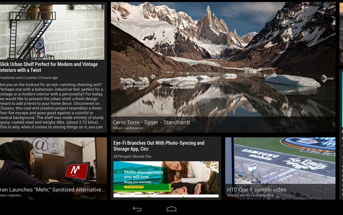


Figure 1. Google Currents scrolls stories past in a smooth, constantly-moving wall of news.


Google Currents is a great example of this approach: as a Daydream, it shows a sliding wall of visually-interesting stories selected from your editions. Touch a story, however, and Currents will show it to you full-screen; touch again to read it in the full Currents app.


The architecture of a Daydream


Each Daydream implementation is a subclass of android.service.dreams.DreamService. When you extend DreamService, you’ll have access to a simple Activity-like lifecycle API.


Key methods on DreamService to override in your subclass (don’t forget to call the superclass implementation):


Important methods on DreamService that you may want to call:


  • setContentView() — set the scene for your Daydream. Can be a layout XML resource ID or an instance of View, even a custom View you implement yourself.

  • setInteractive(boolean) — by default, your Daydream will exit if the user touches the screen, like a classic screen saver. If you want the user to be able to touch and interact with your Views, call setInteractive(true).

  • setFullscreen(boolean) — convenience method for hiding the status bar (see below).

  • setScreenBright(boolean) — by default, Daydreams keep the screen on at full brightness, which may not be appropriate for some situations (for example, dark rooms); setting this to false will reduce the display brightness to a very low level.


Finally, to advertise your Daydream to the system, create a <service> for it in your AndroidManifest.xml:


<?xml version="1.0" encoding="utf-8"?>
<manifest xmlns:android="http://schemas.android.com/apk/res/android"
package="com.example.app">
<uses-sdk android:targetSdkVersion="17" android:minSdkVersion="17" />

<application>
<service
android:name=".ExampleDaydream"
android:exported="true"
android:label="@string/my_daydream_name">
<intent-filter>
<action android:name="android.service.dreams.DreamService" />
<category android:name="android.intent.category.DEFAULT" />
</intent-filter>
<meta-data
android:name="android.service.dream"
android:resource="@xml/dream_info" />
</service>
</application>
</manifest>


The <meta-data> tag is optional; it allows you to point to an XML resource that specifies a settings Activity specific to your Daydream. The user can reach it by tapping the settings icon next to your Daydream’s name in the Settings app.


<!-- res/xml/dream_info.xml -->
<?xml version="1.0" encoding="utf-8"?>
<dream xmlns:android="http://schemas.android.com/apk/res/android"
android:settingsActivity="com.example.app/.ExampleDreamSettingsActivity" />


Here's an example to get you going: a classic screen saver, the bouncing logo, implemented using a TimeAnimator to give you buttery-smooth 60Hz animation.
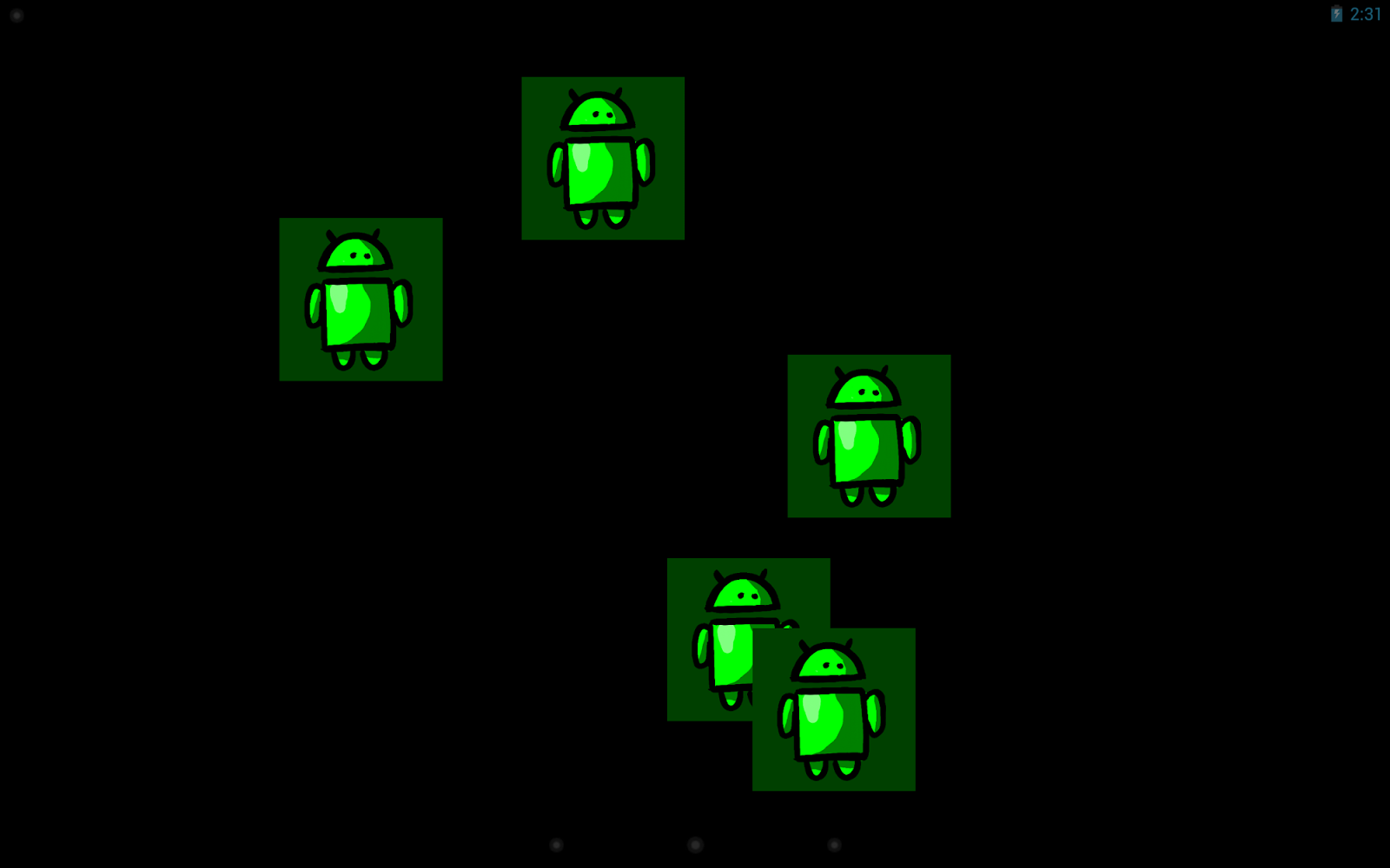


Figure 2. Will one of them hit the corner?


public class BouncerDaydream extends DreamService {
@Override
public void onDreamingStarted() {
super.onDreamingStarted();

// Our content view will take care of animating its children.
final Bouncer bouncer = new Bouncer(this);
bouncer.setLayoutParams(new
ViewGroup.LayoutParams(MATCH_PARENT, MATCH_PARENT));
bouncer.setSpeed(200); // pixels/sec

// Add some views that will be bounced around.
// Here I'm using ImageViews but they could be any kind of
// View or ViewGroup, constructed in Java or inflated from
// resources.
for (int i=0; i<5; i++) {
final FrameLayout.LayoutParams lp
= new FrameLayout.LayoutParams(WRAP_CONTENT, WRAP_CONTENT);
final ImageView image = new ImageView(this);
image.setImageResource(R.drawable.android);
image.setBackgroundColor(0xFF004000);
bouncer.addView(image, lp);
}

setContentView(bouncer);
}
}

public class Bouncer extends FrameLayout implements TimeAnimator.TimeListener {
private float mMaxSpeed;
private final TimeAnimator mAnimator;
private int mWidth, mHeight;

public Bouncer(Context context) {
this(context, null);
}

public Bouncer(Context context, AttributeSet attrs) {
this(context, attrs, 0);
}

public Bouncer(Context context, AttributeSet attrs, int flags) {
super(context, attrs, flags);
mAnimator = new TimeAnimator();
mAnimator.setTimeListener(this);
}

/**
* Start the bouncing as soon as we’re on screen.
*/
@Override
public void onAttachedToWindow() {
super.onAttachedToWindow();
mAnimator.start();
}

/**
* Stop animations when the view hierarchy is torn down.
*/
@Override
public void onDetachedFromWindow() {
mAnimator.cancel();
super.onDetachedFromWindow();
}

/**
* Whenever a view is added, place it randomly.
*/
@Override
public void addView(View v, ViewGroup.LayoutParams lp) {
super.addView(v, lp);
setupView(v);
}

/**
* Reposition all children when the container size changes.
*/
@Override
protected void onSizeChanged (int w, int h, int oldw, int oldh) {
super.onSizeChanged(w, h, oldw, oldh);
mWidth = w;
mHeight = h;
for (int i=0; i<getChildCount(); i++) {
setupView(getChildAt(i));
}
}

/**
* Bouncing view setup: random placement, random velocity.
*/
private void setupView(View v) {
final PointF p = new PointF();
final float a = (float) (Math.random()*360);
p.x = mMaxSpeed * (float)(Math.cos(a));
p.y = mMaxSpeed * (float)(Math.sin(a));
v.setTag(p);
v.setX((float) (Math.random() * (mWidth - v.getWidth())));
v.setY((float) (Math.random() * (mHeight - v.getHeight())));
}

/**
* Every TimeAnimator frame, nudge each bouncing view along.
*/
public void onTimeUpdate(TimeAnimator animation, long elapsed, long dt_ms) {
final float dt = dt_ms / 1000f; // seconds
for (int i=0; i<getChildCount(); i++) {
final View view = getChildAt(i);
final PointF v = (PointF) view.getTag();

// step view for velocity * time
view.setX(view.getX() + v.x * dt);
view.setY(view.getY() + v.y * dt);

// handle reflections
final float l = view.getX();
final float t = view.getY();
final float r = l + view.getWidth();
final float b = t + view.getHeight();
boolean flipX = false, flipY = false;
if (r > mWidth) {
view.setX(view.getX() - 2 * (r - mWidth));
flipX = true;
} else if (l < 0) {
view.setX(-l);
flipX = true;
}
if (b > mHeight) {
view.setY(view.getY() - 2 * (b - mHeight));
flipY = true;
} else if (t < 0) {
view.setY(-t);
flipY = true;
}
if (flipX) v.x *= -1;
if (flipY) v.y *= -1;
}
}

public void setSpeed(float s) {
mMaxSpeed = s;
}
}


This example code is handy for anything you want to show the user without burning it into the display (like a simple graphic or an error message), and it also makes a great starting point for more complex Daydream projects.


A few more idle thoughts


  • First, do no harm: Daydream is meant to run when a device is charging. However, if the Daydream consumes too much CPU, charging might happen very slowly or not at all! The system will stop your Daydream if it detects that the device is not charging, so make sure your code leaves enough power to charge the battery in a reasonable amount of time.

  • Respect the lockscreen: Daydream runs on top of the secure keyguard, which means that if you might be showing sensitive content, you need to give the user tools to control that content. For example, Photo Table and Photo Frame allow the user to select the albums from which photos will be displayed (avoiding embarrassing slideshows).

  • Screen brightness: Think about where you expect your Daydream to be used and adjust the screen brightness accordingly using setScreenBright() and possibly even using darker or brighter colors as necessary. A bedside clock will need to be dimmer than a desk clock; if you expect your Daydream to serve both purposes you'll need to give the user a choice.

  • To hide the status bar or not: Many users will need instant access to the battery level and time of day, so you should avoid using setFullscreen(), particularly if your Daydream is more informational than artistic. Daydream will start with the status bar in “lights out” mode (View.SYSTEM_UI_FLAG_LOW_PROFILE), where it’s quite unobtrusive but still shows the clock and charge status.

  • When to use settings: In general, you have a little latitude for adding extra knobs and dials to Daydream settings. After all, this is a personalization feature, so users should be encouraged to tweak things until they feel at home. Sometimes, though, a more compelling experience can come from taking an artistic stand: giving the user a choice from a small number of polished, beautiful configurations (rather than providing all the controls of a commercial airline cockpit).

  • There can be more than one: If you discover that your settings allow the user to pick between a few radically different display modes, consider splitting your Daydream into multiple DreamService implementations. For example, the photo gallery in Android 4.2 provides both the Photo Table and Photo Frame Daydreams.

  • Use an Activity for development: Most Android development tools are optimized for developing and debugging conventional Android apps; since DreamService and Activity are so similar, it can be useful to create a testing Activity that hosts the same content view as your DreamService. This way you can launch and test your code easily from your IDE as if it were any other Android project.


OK, that’s enough for now; you have the tools to go build Daydream support into your apps. Have fun with it — if you do, your users will have fun too. Oh, and when you upload your shiny new APK to Google Play, be sure to add a note to your app’s description so that users searching for Daydreams can discover it.


Further reading and samples


  • API docs for DreamService

  • Sample code: BouncerDaydream, complete project for the code snippets in this post

  • Sample code: WebView, a Daydream that shows an HTML page

  • Sample code: Colors, a Daydream that demonstrates OpenGL ES 2.0 and TextureView


Building Quality Tablet Apps

Posted by Reto Meier, Android Developer Relations Tech Lead


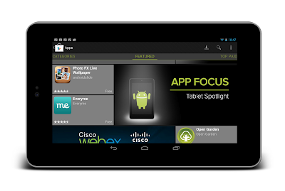
With the release of Nexus 7 earlier this year, we shared some tips on how you can get your apps ready for a new wave of Android tablets. With the holiday season now approaching, we’re creating even more ways for great tablet apps to be featured in Google Play - including a series of new app collections that highlight great apps specifically for tablet users.


To help you take advantage of the opportunity provided by the growing tablet market, we’ve put together this Tablet App Quality Checklist to make it easier for you to ensure your app meets the expectations of tablet users.


The checklist includes a number of key focus areas for building apps that are a great experience on tablets, including:

  • Optimizing your layouts for larger screens

  • Taking advantage of extra screen area available on tablets

  • Using Icons and other assets that are designed for tablet screens


Each focus area comprises several smaller tasks or best practices. As you move through the checklist, you'll find links to support resources that can help you address the topics raised in each task.


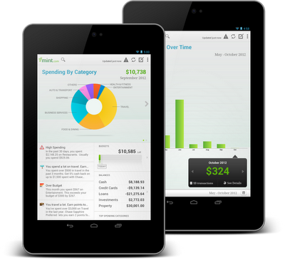
The benefits of building an app that works great on tablets is evident in the experiences of Mint.com, Tiny Co, and Instapaper who reported increased user engagement, better monetization, and more downloads from tablet users. You can find out more about their experience in these developer case studies.


The Tablet Quality Checklist is a great place to get started, but it’s just the beginning. We’ll be sharing more tablet development tips every day this week on +Android Developers. In Android Developers Live, Tuesday’s Android Design in Action broadcast will focus on optimizing user experience for tablets, on Thursday we’ll be interviewing our tablet case studies during Developers Strike Back, and on Friday’s live YouTube broadcasts of The App Clinic and Friday Games Review will be reviewing apps and games on Android tablets.


What are your best tips for building great

tablet apps?


Join the discussion on

+Android Developers


Accessibility: Are You Serving All Your Users?

[This post is by Joe Fernandez, a technical writer for developer.android.com who cares about accessibility and usability. — Tim Bray.]

We recently published some new resources to help developers make their Android applications more accessible:

“But,” you may be thinking, “What is accessibility, exactly? Why should I make it a priority? How do I do it? And most importantly, how do I spell it?” All good questions. Let’s hit some of the key points.


Accessibility is about making sure that Android users who have limited vision or other physical impairments can use your application just as well as all those folks in line at the supermarket checking email on their phones.
It’s also about the Mom over in the produce section whose kids are driving her to distraction, and really needs to see that critical notification your application is trying to deliver. It’s also about you, in the future; Is your eyesight getting better over time? How about that hand-eye coordination?

When it comes down to it, making an application accessible is about having a deep commitment to usability, getting the details right and delighting your users. It also means stepping into new territory and getting a different perspective on your application. Try it out: Open up an application you developed (or your all-time favorite app), then close your eyes and try to complete a task. No peeking! A little challenging, right?

How Android Enables Accessibility

One of main ways that Android enables accessibility is by allowing users to hear spoken feedback that announces the content of user interface components as they interact with applications. This spoken feedback is provided by an accessibility service called TalkBack, which is available for free on Google Play and has become a standard component of recent Android releases.

Now enable TalkBack, and try that eyes-closed experiment again. Being able to hear your application’s interface probably makes this experiment a little easier, but it’s still challenging. This type of interaction is how many folks with limited vision use their Android devices every day. The spoken feedback works because all the user interface components provided by the Android framework are built so they can provide descriptions of themselves to accessibility services like TalkBack.

Another key element of accessibility on Android devices is the ability to use alternative navigation. Many users prefer directional controllers such as D-pads, trackballs or keyboard arrows because it allows them to make discrete, predictable movements through a user interface. You can try out directional control with your apps using the virtual keyboard in the Android emulator or by installing and enabling the Eyes-Free Keyboard on your device. Android enables this type of navigation by default, but you, as a developer, may need to take a few steps to make sure users can effectively navigate your app this way.

How to Make Your Application Accessible

It would be great to be able to give you a standard recipe for accessibility, but the truth of the matter is that the right answer depends on the design and functionality of your application. Here are some key steps for ensuring that your application is accessible:

  1. Task flows: Design well-defined, clear task flows with minimal navigation steps, especially for major user tasks, and make sure those tasks are navigable via focus controls (see item 4).


  2. Action target size: Make sure buttons and selectable areas are of sufficient size for users to easily touch them, especially for critical actions. How big? We recommend that touch targets be 48dp (roughly 9mm) or larger.

  3. Label user interface controls: Label user interface components that do not have visible text, especially ImageButton, ImageView, and EditText components. Use the android:contentDescription XML layout attribute or setContentDescription() to provide this information for accessibility services.


  4. Enable focus-based navigation: Make sure users can navigate your screen layouts using hardware-based or software directional controls (D-pads, trackballs and keyboards). In a few cases, you may need to make UI components focusable or change the focus order to be more logical.


  5. Use framework-provided controls: Use Android's built-in user interface controls whenever possible, as these components provide accessibility support by default.


  6. Custom view controls: If you build custom interface controls for your application, implement accessibility interfaces for your custom views and provide text labels for the controls.


  7. Test: Checking off the items on this list doesn’t guarantee your app is accessible. Test accessibility by attempting to navigate your application using directional controls, and also try eyes free navigation with the TalkBack service enabled.


Here’s an example of implementing some basic accessibility features for an ImageButton inside an XML layout:

<ImageButton
android:id="@+id/add_note_button"
android:src="@drawable/add_note_image"
android:contentDescription="@string/add_note_description"/>

Notice that we’ve added a content description that accessibility services can use to provide an audible explanation of the button. Users can navigate to this button and activate it with directional controls, because ImageButton objects are focusable by default (so you don’t have to include the android:focusable="true" attribute).

The good news is that, in most cases, implementing accessibility isn’t about radically restructuring your application, but rather working through the subtle details of accessibility. Making sure your application is accessible is an opportunity to look at your app from a different perspective, improve the overall quality of your app and ensure that all your users have a great experience.

Android Design V2: Now with stencils

[This post is by Android designer Alex Faaborg, on behalf of the entire User Experience team. —Tim Bray]

When we initially released Android Design, by far the number one request we received was for us to release stencils as well. The fine folks on the Android User Experience team are pleased today to release some official Android Design stencils for your mockup-creating pleasure.

With these stencils you can now drag and drop your way to beautifully designed Ice Cream Sandwich (Android 4.0) applications, with grace and ease. The stencils feature the rich typography, colors, interactive controls, and icons found throughout Ice Cream Sandwich, along with some phone and tablet outlines to frame your meticulously crafted creations.

Currently we have stencils available for those venerable interactive design powerhouses Adobe® Fireworks®, and Omni® OmniGraffle® and we may expand to other applications® in the future. The source files for the various icons and controls are also available, created in Adobe® Photoshop®, and Adobe® Illustrator®. Here are the downloads.

We’ll be updating these stencils over time so, as always, please send in your feedback!

Happy mockup making,

— Your friendly Android Design Droids

Say Goodbye to the Menu Button

[This post is by Scott Main, lead tech writer for developer.android.com. — Tim Bray]

Before Android 3.0 (Honeycomb), all Android-powered devices included a dedicated Menu button. As a developer, you could use the Menu button to display whatever options were relevant to the user, often using the activity’s built-in options menu. Honeycomb removed the reliance on physical buttons, and introduced the ActionBar class as the standard solution to make actions from the user options immediately visible and quick to invoke. In order to provide the most intuitive and consistent user experience in your apps, you should migrate your designs away from using the Menu button and toward using the action bar. This isn’t a new concept — the action bar pattern has been around on Android even before Honeycomb. As Ice Cream Sandwich rolls out to more devices, it’s important that you begin to migrate your designs to the action bar in order to promote a consistent Android user experience.

You might worry that it’s too much work to begin using the action bar, because you need to support versions of Android older than Honeycomb. However, it’s quite simple for most apps because you can continue to support the Menu button on pre-Honeycomb devices, but also provide the action bar on newer devices with only a few lines of code changes.

If I had to put this whole post into one sentence, it’d be: Set targetSdkVersion to 14 and, if you use the options menu, surface a few actions in the action bar with showAsAction="ifRoom".

Don’t call it a menu

Not only should your apps stop relying on the hardware Menu button, but you should stop thinking about your activities using a “menu button” at all. Your activities should provide buttons for important user actions directly in the action bar (or elsewhere on screen). Those that can’t fit in the action bar end up in the action overflow.

In the screenshot here, you can see an action button for Search and the action overflow on the right side of the action bar.

Even if your app is built to support versions of Android older than 3.0 (in which apps traditionally use the options menu panel to display user options/actions), when it runs on Android 3.0 and beyond, there’s no Menu button. The button that appears in the system/navigation bar represents the action overflow for legacy apps, which reveals actions and user options that have “overflowed off the screen.”

This might seem like splitting hairs over terminology, but the name action overflow promotes a different way of thinking. Instead of thinking about a menu that serves as a catch-all for various user options, you should think more about which user options you want to display on the screen as actions. Those that don't need to be on the screen can overflow off the screen. Users can reveal the overflow and other options by touching an overflow button that appears alongside the on-screen action buttons.

Action overflow button for legacy apps

If you’ve already developed an app to support Android 2.3 and lower, then you might have noticed that when it runs on a device without a hardware Menu button (such as a Honeycomb tablet or Galaxy Nexus), the system adds the action overflow button beside the system navigation.

This is a compatibility behavior for legacy apps designed to ensure that apps built to expect a Menu button remain functional. However, this button doesn’t provide an ideal user experience. In fact, in apps that don’t use an options menu anyway, this action overflow button does nothing and creates user confusion. So you should update your legacy apps to remove the action overflow from the navigation bar when running on Android 3.0+ and begin using the action bar if necessary. You can do so all while remaining backward compatible with the devices your apps currently support.

If your app runs on a device without a dedicated Menu button, the system decides whether to add the action overflow to the navigation bar based on which API levels you declare to support in the <uses-sdk> manifest element. The logic boils down to:

  • If you set either minSdkVersion or targetSdkVersion to 11 or higher, the system will not add the legacy overflow button.


  • Otherwise, the system will add the legacy overflow button when running on Android 3.0 or higher.


  • The only exception is that if you set minSdkVersion to 10 or lower, set targetSdkVersion to 11, 12, or 13, and you do not use ActionBar, the system will add the legacy overflow button when running your app on a handset with Android 4.0 or higher.


That exception might be a bit confusing, but it’s based on the belief that if you designed your app to support pre-Honeycomb handsets and Honeycomb tablets, it probably expects handset devices to include a Menu button (but it supports tablets that don’t have one).

So, to ensure that the overflow action button never appears beside the system navigation, you should set the targetSdkVersion to 14. (You can leave minSdkVersion at something much lower to continue supporting older devices.)

Migrating to the action bar

If you have activities that use the options menu (they implement onCreateOptionsMenu()), then once the legacy overflow button disappears from the system/navigation bar (because you’ve set targetSdkVersion to 14), you need to provide an alternative means for the user to access the activity’s actions and other options. Fortunately, the system provides such a means by default: the action bar.

Add showAsAction="ifRoom" to the <item> elements representing the activity’s most important actions to show them in the action bar when space is available. For help deciding how to prioritize which actions should appear in the action bar, see Android Design’s Action Bar guide.

To further provide a consistent user experience in the action bar, we suggest that you use action icons designed by the Android UX Team where appropriate. The available icons support common user actions such as Refresh, Delete, Attach, Star, Share and more, and are designed for the light and dark Holo themes; they’re available on the Android Design downloads page.

If these icons don’t accommodate your needs and you need to create your own, you should follow the Iconography design guide.

Removing the action bar

If you don’t need the action bar, you can remove it from your entire app or from individual activities. This is appropriate for apps that never used the options menu or for apps in which the action bar doesn’t meet design needs (such as games). You can remove the action bar using a theme such as Theme.Holo.NoActionBar or Theme.DeviceDefault.NoActionBar.

In order to use such a theme and remain backward compatible, you can use Android’s resource system to define different themes for different platform versions, as described by Adam Powell’s post, Holo Everywhere. All you need is your own theme, which you define to inherit different platform themes depending on the current platform version.

For example, here’s how you can declare a custom theme for your application:

<application android:theme="@style/NoActionBar">

Or you can instead declare the theme for individual <activity> elements.

For pre-Honeycomb devices, include the following theme in res/values/themes.xml that inherits the standard platform theme:

<resources>
<style name="NoActionBar" parent="@android:style/Theme">
<!-- Inherits the default theme for pre-HC (no action bar) -->
</style>
</resources>

For Honeycomb and beyond, include the following theme in res/values-v11/themes.xml that inherits a NoActionBar theme:

<resources>
<style name="NoActionBar" parent="@android:style/Theme.Holo.NoActionBar">
<!-- Inherits the Holo theme with no action bar; no other styles needed. -->
</style>
</resources>

At runtime, the system applies the appropriate version of the NoActionBar theme based on the system’s API version.

Summary

  • Android no longer requires a dedicated Menu button, some devices don’t have one, and you should migrate away from using it.


  • Set targetSdkVersion to 14, then test your app on Android 4.0.


  • Add showAsAction="ifRoom" to menu items you’d like to surface in the action bar.


  • If the ActionBar doesn’t work for your app, you can remove it with Theme.Holo.NoActionBar or Theme.DeviceDefault.NoActionBar.

For information about how you should design your action bar, see Android Design’s Action Bar guide. More information about implementing the action bar is also available in the Action Bar developer guide.

Introducing the Android Design site

[This post is by Christian Robertson, who leads the Android visual design group. He is also the designer of the Roboto font family. —Tim Bray]

Ice Cream Sandwich (Android 4.0) is our biggest redesign yet — both for users and developers. We’ve enhanced the UI framework with new interactions and styles that will let you create Android apps that are simpler and more beautiful than ever before.


To help you use great UI in your apps, we’re introducing Android Design: the place to learn about principles, building blocks, and patterns for creating world-class Android user interfaces.
Whether you’re a UI professional or a developer playing that role, these docs show you how to make good design decisions, big and small.

The Android User Experience Team is committed to helping you design amazing apps that people love, and this is just the beginning. In the coming months, we’ll expand Android Design with more in-depth content. And watch this blog for a series of posts about design, and invitations to Google+ hangouts on the topics you care about most.

So head on over to Android Design, and make something amazing!

Holo Everywhere

[This post is by Adam Powell, an Android Framework engineer who cares about style. —Tim Bray]

Android 4.0 showcases the Holo theme family, further refined since its debut in Android 3.0. But as most developers know, a new system theme for some Android devices isn’t a new or uncommon event. For developers new system themes mean more design targets for their apps. Using system themes means developers can take advantage of a user’s existing expectations and it can save a lot of production time, but only if an app designer can reliably predict the results. Before Android 4.0 the variance in system themes from device to device could make it difficult to design an app with a single predictable look and feel. We set out to improve this situation for the developer community in Ice Cream Sandwich and beyond.


Theme.Holo
If you’re not already familiar with Android’s style and theme system, you should read Styles and Themes before continuing.

Compatibility Standard

In Android 4.0, Holo is different. We’ve made the inclusion of the unmodified Holo theme family a compatibility requirement for devices running Android 4.0 and forward. If the device has Android Market it will have the Holo themes as they were originally designed.

This standardization goes for all of the public Holo widget styles as well. The Widget.Holo styles will be stable from device to device, safe for use as parent styles for incremental customizations within your app.

The Holo theme family in Android 4.0 consists of the themes Theme.Holo, Theme.Holo.Light, and Theme.Holo.Light.DarkActionBar. Examples of these themes in action are shown in the screenshots lining this post.

To use a Holo theme, explicitly request one from your manifest on your activity or application element, e.g. android:theme="@android:style/Theme.Holo". Your app will be displayed using the unmodified theme on all compatible Android 4.0 devices. The Holo themes may also be used as stable parent themes for app-level theme customizations.

What about device themes?

We have no desire to restrict manufacturers from building their own themed experience across their devices. In fact we’ve gone further to make this even easier. In Android 4.0’s API (level 14) we’ve added a new public theme family to complement the Holo family introduced in Android 3.0: DeviceDefault. DeviceDefault themes are aliases for the device’s native look and feel. The DeviceDefault theme family and widget style family offer ways for developers to target the device’s native theme with all customizations intact.


Theme.Holo.Light
Formally separating these theme families will also make future merges easier for manufacturers updating to a new platform version, helping more devices update more quickly. Google’s Nexus devices alias DeviceDefault to the unmodified Holo themes.

Making use of your chosen theme

We’ve added a number of theme attributes to report common metrics and color palette info to apps that want to fit in with a theme. These include highlight colors, default padding and margins for common UI elements such as list items, and more. Apps that wish to integrate with their chosen theme (both Holo and DeviceDefault included) can refer to these theme attributes as in the examples below:

Sample button with system-supplied touch highlight:

<ImageButton android:id="@+id/my_button"
android:layout_width="wrap_content"
android:layout_height="wrap_content"
android:src="@drawable/button_icon"
android:background="?android:attr/selectableItemBackground" />
Sample widget with a custom pressedHighlightColor attribute, value retrieved from the system theme:

<MyWidget android:layout_width="wrap_content"
android:layout_height="wrap_content"
myapp:pressedHighlightColor="?android:attr/colorPressedHighlight" />
Sample list item layout using system-supplied metrics and text appearance:

<LinearLayout android:layout_width="match_parent"
android:layout_height="?android:attr/listPreferredItemHeight"
android:paddingLeft="?android:attr/listPreferredItemPaddingLeft"
android:paddingRight="?android:attr/listPreferredItemPaddingRight">
<TextView android:id="@+id/text"
android:textAppearance="?android:attr/textAppearanceListItem" />
<!-- Other views here -->
</LinearLayout>


Theme.Holo.Light.DarkActionBar

(Available in API level 14 and above)

Defaults for Older Apps

If an app does not explicitly request a theme in its manifest, Android 4.0 will determine the default theme based on the app’s targetSdkVersion to maintain the app’s original expectations: For values less than 11, @android:style/Theme; between 11 and 13 @android:style/Theme.Holo; and for 14 and higher @android:style/Theme.DeviceDefault.

Using Holo while supporting Android 2.x

Most Android developers will still want to support 2.x devices for a while as updates and new devices continue to roll out. This doesn’t stop you from taking advantage of newer themes on devices that support them though. Using Android’s resource system you can define themes for your app that are selected automatically based on the platform version of the device it’s running on.

Theme.Holo and Theme.Holo.Light have been available since API level 11, but Theme.Holo.Light.DarkActionBar is new in API level 14.

res/values/themes.xml:

<resources>
<style name="MyTheme" parent="@android:style/Theme">
<!-- Any customizations for your app running on pre-3.0 devices here -->
</style>
</resources>
res/values-v11/themes.xml:

<resources>
<style name="MyTheme" parent="@android:style/Theme.Holo">
<!-- Any customizations for your app running on devices with Theme.Holo here -->
</style>
</resources>
Finally, in AndroidManifest.xml:

<!-- [...] -->
<application android:name="MyApplication"
android:label="@string/application_label"
android:icon="@drawable/app_icon"
android:hardwareAccelerated="true"
android:theme="@style/MyTheme">
<!-- [...] -->
You can go as far with this idea as you like, up to and including defining your own theme attributes with different values across configurations for use in your other resources. To learn more about Android’s resource system, see Application Resources.

Final Thoughts

Android apps running on 4.0 and forward can use the Holo themes and be assured that their look and feel will not change when running on a device with a custom skin. Apps that wish to use the device’s default styling can do so using the DeviceDefault themes that are now in the public API. These changes let you spend more time on your design and less time worrying about what will be different from one device to another. Finally, Android’s resource system allows you to support features from the latest platform version while offering graceful fallback on older devices.

New Editing Features in Eclipse plug-in for Android

At the Google I/O conference a month ago, we demonstrated the next version of the Android Development Tools (ADT) plugin. Today we’re happy to announce that version 11 is done and available for download!

ADT 11 focuses on editor improvements. First, it offers several new visual refactoring operations, such as “Extract Include” and “Extract Style,” which help automatically extract duplicated layout fragments and style attributes into reusable layouts, styles, and themes.

Second, the visual layout editor now supports fragments, palette configurations, and improved support for custom views.

Last, XML editing has been improved with new quick fixes, code completion in more file types and many “go to declaration” enhancements.

ADT 11 packs a long list of new features and enhancements. Please visit our ADT page for more details. For an in-depth demo, check out the video of our Android Development Tools session at Google I/O, below.

Please note that the visual layout editor depends on a layout rendering library that ships with each version of the platform component in the SDK. We are currently working on a number of improvements to this library as well, which we plan to release soon for all platform versions. When we release the updates, some new features in ADT 11 will be “unlocked” - such as support for ListView previewing - so keep an eye on this blog for further announcements.


Customizing the Action Bar

[This post is by Nick Butcher, an Android engineer who notices small imperfections, and they annoy him. — Tim Bray]

Since the introduction of the Action Bar design pattern, many applications have adopted it as a way to provide easy access to common actions. In Android 3.0 (or Honeycomb to its friends) this pattern has been baked in as the default navigation paradigm and extended to take advantage of the extra real-estate available on tablets. By using the Action Bar in your Honeycomb-targeted apps, you'll give your users a familiar way to interact with your application. Also, your app will be better prepared to scale across the range of Android devices that will be arriving starting in the Honeycomb era.

Just because Action Bars are familiar, doesn’t mean that they have to be identical! The following code samples and accompanying project demonstrate how to style the Action Bar to match your application’s branding. I’ll demonstrate how to take Honeycomb’s Holo.Light theme and customise it to match this blog’s colour scheme.

<style name="Theme.AndroidDevelopers" parent="android:style/Theme.Holo.Light">

</style>

Icon

This step is easy; I’ll use the wonderful Android Asset Studio to create an icon in my chosen colour scheme. For extra credit, I’ll use this image as a starting point to create a more branded logo.

Navigation

Next up, the navigation section of the Action Bar operates in three different modes; I’ll tackle each of these in turn.

Standard

The Action Bar’s standard navigation mode simply displays the title of the activity. This doesn’t require any styling... next!

List

To the left, a standard list drop-down; to the right, the effect we want to achieve.

The default styling in list navigation mode has a blue colour scheme. This is evident when touching the collapsed control in both the top bar, and the selection highlight in the expanded list. We can theme this element by overriding android:actionDropDownStyle with a custom style to implement our colour scheme:

<!-- style the list navigation -->
<style name="MyDropDownNav" parent="android:style/Widget.Holo.Light.Spinner.DropDown.ActionBar">
<item name="android:background">@drawable/ad_spinner_background_holo_light</item>
<item name="android:popupBackground">@drawable/ad_menu_dropdown_panel_holo_light</item>
<item name="android:dropDownSelector">@drawable/ad_selectable_background</item>
</style>

The above uses a combination of state list drawables and 9 patch images to style the collapsed spinner, the top bar of the expanded list and sets the highlight colour when picking an item.

Tabs

Here are the before-and-after shots on the tab navigation control:

The tab navigation control uses the standard blue colouring. We can apply a custom style to android:actionBarTabStyle to set our own custom drawable that uses our desired palette:

<!-- style for the tabs -->
<style name="MyActionBarTabStyle" parent="android:style/Widget.Holo.Light.ActionBarView_TabView">
<item name="android:background">@drawable/actionbar_tab_bg</item>
<item name="android:paddingLeft">32dp</item>
<item name="android:paddingRight">32dp</item>
</style>

Actions

Before-and-after on the individual items in the Action Bar:

The individual action items inherit the default blue background when selected. We can customise this behaviour by overriding android:selectableItemBackground and setting a shape drawable with our desired colouring:

<item name="android:selectableItemBackground">@drawable/ad_selectable_background</item>

The overflow menu also needs some attention as when expanded it shows a blue bar at the top of the list. We can override android:popupMenuStyle and set a custom drawable (in fact the very same drawable we previously used for list navigation) for the top of the overflow menu:

<!-- style the overflow menu -->
<style name="MyPopupMenu" parent="android:style/Widget.Holo.Light.ListPopupWindow">
<item name="android:popupBackground">@drawable/ad_menu_dropdown_panel_holo_light</item>
</style>

Selecting items within the overflow menu also show the default selection colour. We can set our customised selection colour by overriding android:dropDownListViewStyle:

<!-- style the items within the overflow menu -->
<style name="MyDropDownListView" parent="android:style/Widget.Holo.ListView.DropDown">
<item name="android:listSelector">@drawable/ad_selectable_background</item>
</style>

These changes gets us most of the way there but it’s attention to detail that makes an app. Check boxes and radio buttons within menu items in the overflow section are still using the default assets which have a blue highlight. Let’s override them to fit in with our theme:

<item name="android:listChoiceIndicatorMultiple">@drawable/ad_btn_check_holo_light</item>
<item name="android:listChoiceIndicatorSingle">@drawable/ad_btn_radio_holo_light</item>

Background

I’ve left the background transparent as inheriting form Holo.Light works well for our desired palette. If you’d like to customise it you easily override the android:background item on the android:actionBarStyle style:

<style name="MyActionBar" parent="android:style/Widget.Holo.Light.ActionBar">
<item name="android:background">@drawable/action_bar_background</item>
</style>

Bringing it all together

Putting all of these components together we can create a custom style:

<style name="Theme.AndroidDevelopers" parent="android:style/Theme.Holo.Light">
<item name="android:selectableItemBackground">@drawable/ad_selectable_background</item>
<item name="android:popupMenuStyle">@style/MyPopupMenu</item>
<item name="android:dropDownListViewStyle">@style/MyDropDownListView</item>
<item name="android:actionBarTabStyle">@style/MyActionBarTabStyle</item>
<item name="android:actionDropDownStyle">@style/MyDropDownNav</item>
<item name="android:listChoiceIndicatorMultiple">@drawable/ad_btn_check_holo_light</item>
<item name="android:listChoiceIndicatorSingle">@drawable/ad_btn_radio_holo_light</item>
</style>

We can then apply this style to either an individual activity or to the entire application:


<activity android:name=".MainActivity"
android:label="@string/app_name"
android:theme="@style/Theme.AndroidDevelopers"
android:logo="@drawable/ad_logo">

Note that some of the system styles that we have overridden in this example will affect much more than the Action Bar. For example overriding android:selectableItemBackground will effect many widgets which support a selectable state. This is useful for styling your entire application but be sure to test that your customisations are applied consistently throughout.

Familiar but styled

Customising the action bar is a great way to extend your application’s branding to the standard control components. With this power, as they say, comes great responsibility. When customising the user interface you must take great care to ensure that your application remains legible and navigable. In particular, watch out for highlight colours which contrast poorly with text and provide drawables for all relevant states. Explore this demo application which exercises the functionality offered by the Action Bar and demonstrates how to theme it.

Android 3.0 Hardware Acceleration

[This post is by Romain Guy, who likes things on your screen to move fast. —Tim Bray]

One of the biggest changes we made to Android for Honeycomb is the addition of a new rendering pipeline so that applications can benefit from hardware accelerated 2D graphics. Hardware accelerated graphics is nothing new to the Android platform, it has always been used for windows composition or OpenGL games for instance, but with this new rendering pipeline applications can benefit from an extra boost in performance. On a Motorola Xoom device, all the standard applications like Browser and Calendar use hardware-accelerated 2D graphics.

In this article, I will show you how to enable the hardware accelerated 2D graphics pipeline in your application and give you a few tips on how to use it properly.

Go faster

To enable the hardware accelerated 2D graphics, open your AndroidManifest.xml file and add the following attribute to the <application /> tag:

    android:hardwareAccelerated="true"

If your application uses only standard widgets and drawables, this should be all you need to do. Once hardware acceleration is enabled, all drawing operations performed on a View's Canvas are performed using the GPU.

If you have custom drawing code you might need to do a bit more, which is in part why hardware acceleration is not enabled by default. And it's why you might want to read the rest of this article, to understand some of the important details of acceleration.

Controlling hardware acceleration

Because of the characteristics of the new rendering pipeline, you might run into issues with your application. Problems usually manifest themselves as invisible elements, exceptions or different-looking pixels. To help you, Android gives you 4 different ways to control hardware acceleration. You can enable or disable it on the following elements:

  • Application

  • Activity

  • Window

  • View

To enable or disable hardware acceleration at the application or activity level, use the XML attribute mentioned earlier. The following snippet enables hardware acceleration for the entire application but disables it for one activity:

    <application android:hardwareAccelerated="true">
<activity ... />
<activity android:hardwareAccelerated="false" />
</application>

If you need more fine-grained control, you can enable hardware acceleration for a given window at runtime:

    getWindow().setFlags(
WindowManager.LayoutParams.FLAG_HARDWARE_ACCELERATED,
WindowManager.LayoutParams.FLAG_HARDWARE_ACCELERATED);

Note that you currently cannot disable hardware acceleration at the window level. Finally, hardware acceleration can be disabled on individual views:

    view.setLayerType(View.LAYER_TYPE_SOFTWARE, null);

Layer types have many other usages that will be described later.

Am I hardware accelerated?

It is sometimes useful for an application, or more likely a custom view, to know whether it currently is hardware accelerated. This is particularly useful if your application does a lot of custom drawing and not all operations are properly supported by the new rendering pipeline.

There are two different ways to check whether the application is hardware accelerated:

If you must do this check in your drawing code, it is highly recommended to use Canvas.isHardwareAccelerated() instead of View.isHardwareAccelerated(). Indeed, even when a View is attached to a hardware accelerated window, it can be drawn using a non-hardware accelerated Canvas. This happens for instance when drawing a View into a bitmap for caching purpose.

What drawing operations are supported?

The current hardware accelerated 2D pipeline supports the most commonly used Canvas operations, and then some. We implemented all the operations needed to render the built-in applications, all the default widgets and layouts, and common advanced visual effects (reflections, tiled textures, etc.) There are however a few operations that are currently not supported, but might be in a future version of Android:

  • Canvas
    • clipPath

    • clipRegion

    • drawPicture

    • drawPoints

    • drawPosText

    • drawTextOnPath

    • drawVertices


  • Paint
    • setLinearText

    • setMaskFilter

    • setRasterizer


In addition, some operations behave differently when hardware acceleration enabled:

  • Canvas
    • clipRect: XOR, Difference and ReverseDifference clip modes are ignored; 3D transforms do not apply to the clip rectangle

    • drawBitmapMesh: colors array is ignored

    • drawLines: anti-aliasing is not supported

    • setDrawFilter: can be set, but ignored


  • Paint
    • setDither: ignored

    • setFilterBitmap: filtering is always on

    • setShadowLayer: works with text only


  • ComposeShader
    • A ComposeShader can only contain shaders of different types (a BitmapShader and a LinearGradientShader for instance, but not two instances of BitmapShader)

    • A ComposeShader cannot contain a ComposeShader


If drawing code in one of your views is affected by any of the missing features or limitations, you don't have to miss out on the advantages of hardware acceleration for your overall application. Instead, consider rendering the problematic view into a bitmap or setting its layer type to LAYER_TYPE_SOFTWARE. In both cases, you will switch back to the software rendering pipeline.

Dos and don'ts

Switching to hardware accelerated 2D graphics is a great way to get smoother animations and faster rendering in your application but it is by no means a magic bullet. Your application should be designed and implemented to be GPU friendly. It is easier than you might think if you follow these recommendations:

  • Reduce the number of Views in your application: the more Views the system has to draw, the slower it will be. This applies to the software pipeline as well; it is one of the easiest ways to optimize your UI.

  • Avoid overdraw: always make sure that you are not drawing too many layers on top of each other. In particular, make sure to remove any Views that are completely obscured by other opaque views on top of it. If you need to draw several layers blended on top of each other consider merging them into a single one. A good rule of thumb with current hardware is to not draw more than 2.5 times the number of pixels on screen per frame (and transparent pixels in a bitmap count!)

  • Don't create render objects in draw methods: a common mistake is to create a new Paint, or a new Path, every time a rendering method is invoked. This is not only wasteful, forcing the system to run the GC more often, it also bypasses caches and optimizations in the hardware pipeline.

  • Don't modify shapes too often: complex shapes, paths and circles for instance, are rendered using texture masks. Every time you create or modify a Path, the hardware pipeline must create a new mask, which can be expensive.

  • Don't modify bitmaps too often: every time you change the content of a bitmap, it needs to be uploaded again as a GPU texture the next time you draw it.

  • Use alpha with care: when a View is made translucent using View.setAlpha(), an AlphaAnimation or an ObjectAnimator animating the “alpha” property, it is rendered in an off-screen buffer which doubles the required fill-rate. When applying alpha on very large views, consider setting the View's layer type to LAYER_TYPE_HARDWARE.

View layers

Since Android 1.0, Views have had the ability to render into off-screen buffers, either by using a View's drawing cache, or by using Canvas.saveLayer(). Off-screen buffers, or layers, have several interesting usages. They can be used to get better performance when animating complex Views or to apply composition effects. For instance, fade effects are implemented by using Canvas.saveLayer() to temporarily render a View into a layer and then compositing it back on screen with an opacity factor.

Because layers are so useful, Android 3.0 gives you more control on how and when to use them. To to so, we have introduced a new API called View.setLayerType(int type, Paint p). This API takes two parameters: the type of layer you want to use and an optional Paint that describes how the layer should be composited. The paint parameter may be used to apply color filters, special blending modes or opacity to a layer. A View can use one of 3 layer types:

  • LAYER_TYPE_NONE: the View is rendered normally, and is not backed by an off-screen buffer.

  • LAYER_TYPE_HARDWARE: the View is rendered in hardware into a hardware texture if the application is hardware accelerated. If the application is not hardware accelerated, this layer type behaves the same as LAYER_TYPE_SOFTWARE.

  • LAYER_TYPE_SOFTWARE: the View is rendered in software into a bitmap

The type of layer you will use depends on your goal:

  • Performance: use a hardware layer type to render a View into a hardware texture. Once a View is rendered into a layer, its drawing code does not have to be executed until the View calls invalidate(). Some animations, for instance alpha animations, can then be applied directly onto the layer, which is very efficient for the GPU to do.

  • Visual effects: use a hardware or software layer type and a Paint to apply special visual treatments to a View. For instance, you can draw a View in black and white using a ColorMatrixColorFilter.

  • Compatibility: use a software layer type to force a View to be rendered in software. This is an easy way to work around limitations of the hardware rendering pipeline.

Layers and animations

Hardware-accelerated 2D graphics help deliver a faster and smoother user experience, especially when it comes to animations. Running an animation at 60 frames per second is not always possible when animating complex views that issue a lot of drawing operations. If you are running an animation in your application and do not obtain the smooth results you want, consider enabling hardware layers on your animated views.

When a View is backed by a hardware layer, some of its properties are handled by the way the layer is composited on screen. Setting these properties will be efficient because they do not require the view to be invalidated and redrawn. Here is the list of properties that will affect the way the layer is composited; calling the setter for any of these properties will result in optimal invalidation and no redraw of the targeted View:

  • alpha: to change the layer's opacity

  • x, y, translationX, translationY: to change the layer's position

  • scaleX, scaleY: to change the layer's size

  • rotation, rotationX, rotationY: to change the layer's orientation in 3D space

  • pivotX, pivotY: to change the layer's transformations origin

These properties are the names used when animating a View with an ObjectAnimator. If you want to set/get these properties, call the appropriate setter or getter. For instance, to modify the alpha property, call setAlpha(). The following code snippet shows the most efficient way to rotate a View in 3D around the Y axis:

    view.setLayerType(View.LAYER_TYPE_HARDWARE, null);
ObjectAnimator.ofFloat(view, "rotationY", 180).start();

Since hardware layers consume video memory, it is highly recommended you enable them only for the duration of the animation. This can be achieved with animation listeners:

    view.setLayerType(View.LAYER_TYPE_HARDWARE, null);
ObjectAnimator animator = ObjectAnimator.ofFloat(
view, "rotationY", 180);
animator.addListener(new AnimatorListenerAdapter() {
@Override
public void onAnimationEnd(Animator animation) {
view.setLayerType(View.LAYER_TYPE_NONE, null);
}
});
animator.start();

New drawing model

Along with hardware-accelerated 2D graphics, Android 3.0 introduces another major change in the UI toolkit’s drawing model: display lists, which are only enabled when hardware acceleration is turned on. To fully understand display lists and how they may affect your application it is important to also understand how Views are drawn.

Whenever an application needs to update a part of its UI, it invokes invalidate() (or one of its variants) on any View whose content has changed. The invalidation messages are propagated all the way up the view hierarchy to compute the dirty region; the region of the screen that needs to be redrawn. The system then draws any View in the hierarchy that intersects with the dirty region. The drawing model is therefore made of two stages:

  1. Invalidate the hierarchy

  2. Draw the hierarchy

There are unfortunately two drawbacks to this approach. First, this drawing model requires execution of a lot of code on every draw pass. Imagine for instance your application calls invalidate() on a button and that button sits on top of a more complex View like a MapView. When it comes time to draw, the drawing code of the MapView will be executed even though the MapView itself has not changed.

The second issue with that approach is that it can hide bugs in your application. Since views are redrawn anytime they intersect with the dirty region, a View whose content you changed might be redrawn even though invalidate() was not called on it. When this happens, you are relying on another View getting invalidated to obtain the proper behavior. Needless to say, this behavior can change every time you modify your application ever so slightly. Remember this rule: always call invalidate() on a View whenever you modify data or state that affects this View’s drawing code. This applies only to custom code since setting standard properties, like the background color or the text in a TextView, will cause invalidate() to be called properly internally.

Android 3.0 still relies on invalidate() to request screen updates and draw() to render views. The difference is in how the drawing code is handled internally. Rather than executing the drawing commands immediately, the UI toolkit now records them inside display lists. This means that display lists do not contain any logic, but rather the output of the view hierarchy’s drawing code. Another interesting optimization is that the system only needs to record/update display lists for views marked dirty by an invalidate() call; views that have not been invalidated can be redrawn simply by re-issuing the previously recorded display list. The new drawing model now contains 3 stages:

  1. Invalidate the hierarchy

  2. Record/update display lists

  3. Draw the display lists

With this model, you cannot rely on a View intersecting the dirty region to have its draw() method executed anymore: to ensure that a View’s display list will be recorded, you must call invalidate(). This kind of bug becomes very obvious with hardware acceleration turned on and is easy to fix: you would see the previous content of a View after changing it.

Using display lists also benefits animation performance. In the previous section, we saw that setting specific properties (alpha, rotation, etc.) does not require invalidating the targeted View. This optimization also applies to views with display lists (any View when your application is hardware accelerated.) Let’s imagine you want to change the opacity of a ListView embedded inside a LinearLayout, above a Button. Here is what the (simplified) display list of the LinearLayout looks like before changing the list’s opacity:

    DrawDisplayList(ListView)
DrawDisplayList(Button)

After invoking listView.setAlpha(0.5f) the display list now contains this:

    SaveLayerAlpha(0.5)
DrawDisplayList(ListView)
Restore
DrawDisplayList(Button)

The complex drawing code of ListView was not executed. Instead the system only updated the display list of the much simpler LinearLayout. In previous versions of Android, or in an application without hardware acceleration enabled, the drawing code of both the list and its parent would have to be executed again.

It’s your turn

Enabling hardware accelerated 2D graphics in your application is easy, particularly if you rely solely on standard views and drawables. Just keep in mind the few limitations and potential issues described in this document and make sure to thoroughly test your application!

Optimize your layouts


Writing user interface layouts for Android applications is easy, but it can sometimes be difficult to optimize them. Most often, heavy modifications made to existing XML layouts, like shuffling views around or changing the type of a container, lead to inefficiencies that go unnoticed.

Starting with the SDK Tools Revision 3 you can use a tool called layoutopt to automatically detect common problems. This tool is currently only available from the command line and its use is very simple - just open a terminal and launch the layoutopt command with a list of directories or XML files to analyze:


$ layoutopt samples/
samples/compound.xml
7:23 The root-level <FrameLayout/> can be replaced with <merge/>
11:21 This LinearLayout layout or its FrameLayout parent is useless samples/simple.xml
7:7 The root-level <FrameLayout/> can be replaced with <merge/>
samples/too_deep.xml
-1:-1 This layout has too many nested layouts: 13 levels, it should have <= 10!
20:81 This LinearLayout layout or its LinearLayout parent is useless
24:79 This LinearLayout layout or its LinearLayout parent is useless
28:77 This LinearLayout layout or its LinearLayout parent is useless
32:75 This LinearLayout layout or its LinearLayout parent is useless
36:73 This LinearLayout layout or its LinearLayout parent is useless
40:71 This LinearLayout layout or its LinearLayout parent is useless
44:69 This LinearLayout layout or its LinearLayout parent is useless
48:67 This LinearLayout layout or its LinearLayout parent is useless
52:65 This LinearLayout layout or its LinearLayout parent is useless
56:63 This LinearLayout layout or its LinearLayout parent is useless
samples/too_many.xml
7:413 The root-level <FrameLayout/> can be replaced with <merge/>
-1:-1 This layout has too many views: 81 views, it should have <= 80! samples/useless.xml
7:19 The root-level <FrameLayout/> can be replaced with <merge/>
11:17 This LinearLayout layout or its FrameLayout parent is useless
For each analyzed file, the tool will indicate the line numbers of each tag that could potentially be optimized. In some cases, layoutopt will also offer a possible solution.

The current version of layoutopt contains a dozen rules used to analyze your layout files and future versions will contain more. Future plans for this tool also include the ability to create and use your own analysis rules, to automatically modify the layouts with optimized XML, and to use it from within Eclipse and/or a standalone user interface.


Windows users: to start layoutopt, open the file called layoutopt.bat in the tools directory of the SDK and on the last line, replace %jarpath% with -jar %jarpath%.

Popular Posts

 
Support : Your Link | Your Link | Your Link
Copyright © 2013. Official Android Center - All Rights Reserved
Template Created by Creating Website Published by Mas Template
Proudly powered by Blogger